When trading forex you work with currency pairs: one currency is the base currency and the other the counter currency. If the price on the chart goes up, that could mean either that the base currency is gaining strength, that the counter currency is weakening or a combination of the two. This makes trading forex a bit more complex. With trading stocks like e.g. Apple stock (AAPL), the value of the stock can go down or up. You just deal with that one stock in its own right. However, if you see e.g. the USDJPY currency pair going up, you still have to figure out if that is due to USD strength or JPY weakness. That one chart by itself will not give you the answer. You will have to do some homework first.
Currency Matrix
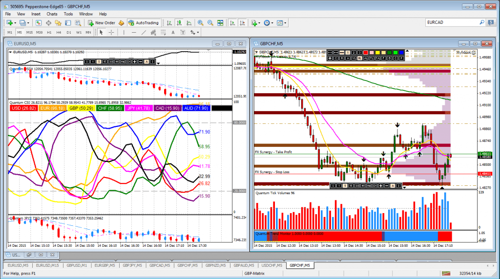
One way to figure out why the price is going up or down on that USDJPY chart is by looking at all the charts related to the USD in relation to other currencies. If you see the dollar gaining strength overall on most of the other charts as well, you have found your answer. The same exercise can be done for the counter currency Yen in the above example. Look at all the Japanese Yen crossovers and look for consistency or inconsistency. Is the dollar gaining in strength on all these dollar cross-over charts? How about the Yen? That is one way you can figure out if a price behavior on a specific currency pair chart is due to increase in strength of one or weakness in the counter currency. However, it is a tedious process as you would e.g. have to look the cross-pairs such as in the chart below where in some cases the USD is the base currency while in other cases it is the counter currency and thus behaving opposite. And then the below charts are all showing 5 minute bars, but you should also compare them at other timeframes. A job that will take some time.

Ideal Currency-Pair Setup
In an ideal world you want to trade a currency pair where either the base currency is strengthening while the counter currency is weakening or visa versa. Such a setup will most likely push the price level on the chart in the right direction. If both the base and counter currency are strengthening at the same time, they would work against each other and promote the pair to remain in a congestion phase instead of breaking out or continuing to rise or fall in value.

Dollar Index
Instead of looking at the cross pairs of the Yen or e.g. the Dollar, a faster way of looking at the general strengthening or weakening of the Dollar or Yen would be to look at the Dollar Index or the Yen Index. Such indexes show on one chart the Dollar or Yen against a basket of other currencies. In one quick instance you can see if the index or in fact the Dollar or Yen is rising or falling. You don’t have to compare all the different cross-pair charts anymore to look for consistency.
Currency Strength Indicator
There is a Dollar Index and also a Yen Index, but not an index for all the other currencies, so a Curency Strength Indicator (CSI) or also called a Currency Strength Meter can come to the rescue here.

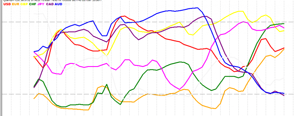
In the above example you see several currencies together on one chart in one specific timeframe, where the red line represents the USD, the orange line the euro, the yellow line the British pound, etc. The two grey dashed horizontal lines at the top and bottom represent areas where a currency is overbought (above top dashed line) or oversold (below bottom dashed line). Currencies generally trade within a range and have the tendency to ‘snap back’ into that range. After all, we are talking about real money and real exchange rates and these rates are used by banks, companies, countries and individuals to trade across borders and thus currency exchange rates can fluctuate but tend to stay within a range.
If you see one line rising strongly and another line falling, you have a potential trade setup to investigate further. In the above image you see the euro (orange line) climbing steeply and thus gaining in strength while both the Canadian and Australian Dollar (CAD and AUD) lines show weakness. The AUD line is horizontal at the end, so it could go anywhere from there, while the CAD is still weakening. The CSI indicator gives you information about possible strong setups where one currency is gaining strength and the other currency is weakening. From here you go and investigate the charts themselves. You compare the CSI in different timeframes to see if the setup shows consistency across the adjacent timeframes, then move to the charts themselves to do the same analysis.
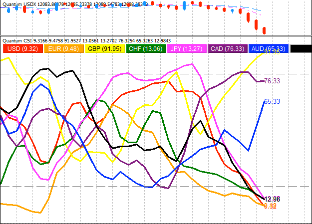
In the example above you see the UK pound (yellow line) going straight up versus the dollar going straight down. Above the CSI indicator above you see the dollar index depicted which confirms the weakening of the dollar. Alternatively you can see other potential setups such as the AUD rising versus the JPY falling. All possible trade setups to investigate further.
The inner workings of the available CSI indicators on the market are often kept a secret. In general, they work with some weighted average or RSI mechanism, although the Apollo indicator seemingly would work in a different way. The idea is not to trade solely using the CSI indicator as your trading mechanism, but to find potential trade setups using the CSI indicator where one currency is strengthening with the other currency in the currency-pair weakening. Then, any further analysis is done on the price charts themselves and taking other aspects into consideration such as the volume (VPA, volume-price-analysis), price-action analysis of the candle sticks, looking at support and resistance areas etc.
Further reading:
Currency Strength Indicator for MT4 by Quantum Trading.
Apollo Currency Strength Meter by Mark Boardman.
Currency Strength Meter explained article.
